Explorify
Role: Senior product designer
Explorify is a free primary science activity resource created by the Wellcome Trust. During my 15 month contract I worked as part of a duo with Simon Grant. We transformed several major areas of the site and turned it into an award winning product!

Problem
Explorify had been established for a year when I joined and was at a stale point. The team was unsure what to tackle next and the design was inconsistent, with no style guide or grid in place. Working with the PM and familiarising ourselves with previous research we found the biggest issue was a lack of engagement from signed up users.
Goal
We wanted to understand and define the type of users we should focus on, and work out the issues preventing post sign up engagement.
Refreshing stale persona’s
The old personas were too wordy to be of use. Simon distilled the original 6 into proto personas, and developed them into assets we could actually use.

User journey workshop
We wanted to identify the pain points our new personas would encounter during the Explorify sign up flow. Using large sketched wireframes of the journey, we ran a workshop to assess potential risks with the team.

Design ideation
Using insight gathered from the workshop we began sketching ideas for the activity list and individual activity pages. We removed the ‘unlocking’ gamification which prevented teachers from immediately accessing activities. And added curriculum based personalization throughout the sign-up flow.
Usability testing
I created high fidelity interactive prototypes for moderated usability testing which took users through the sign-up flow to the activity list page. Then directed users to filter for specific activities. These prototypes were then tested on 8 ‘Unengaged Uma’ participants who Simon sourced.

Image left shows topic personalisation during sign up. Image centre a personalised activity list page. Image right an activity page.
Findings
In hindsight, we were trying to test too much at once and personalization was hard to prove qualitatively. But all was not lost, synthesising the data we discovered the following helpful takeaways:
The information shown on activity cards was not relevant
Search and filters easily missed by time-poor teachers
Activity page redesign well-received but needed further exploration
Teachers wanted the ability to try a few activities upfront before joining
Activity card redesign
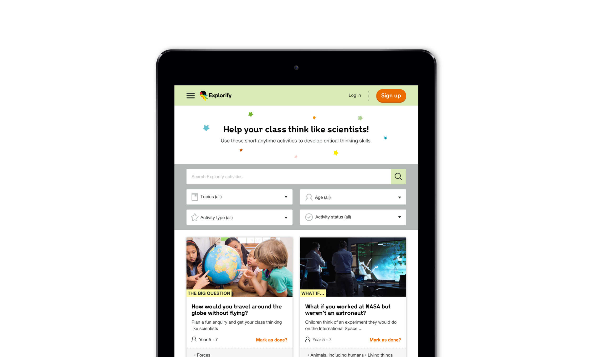
The first redesign I tackled was the activity cards, using findings from the testing. It transpired time was not an important factor, teachers wanted to see curriculum topics and the age group activities were aimed at. The ‘you will need’ blurb was uninformative, so we replaced it with a brief activity overview.

Up front activities
The research showed that new users struggled to understand what Explorify actually was. Slightly alarming! We put three of our most popular activities on the homepage which teachers could access without signing up. Giving them a taste of the product without any of the commitment.

Activity page redesign
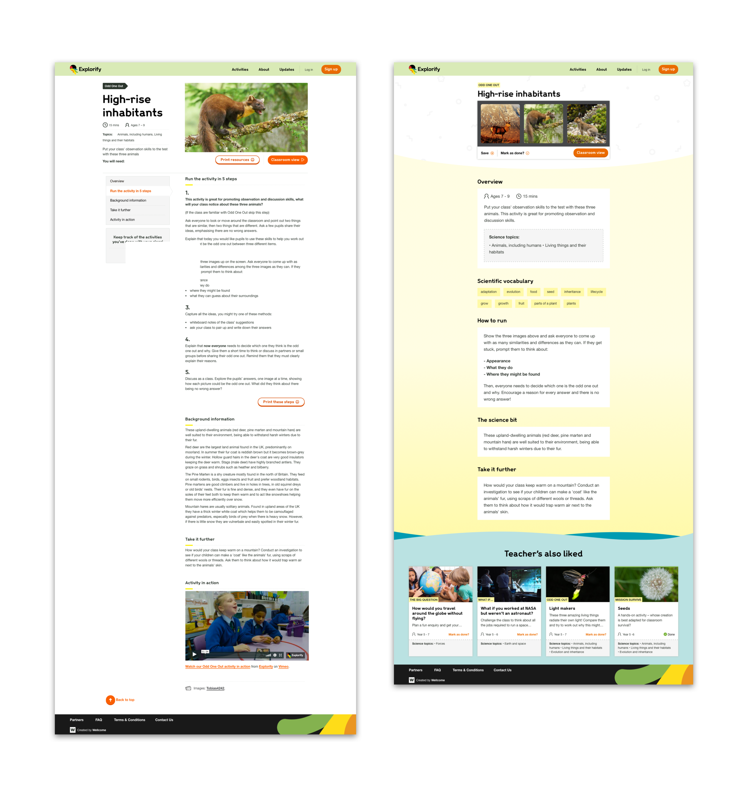
The original activity pages were too copy heavy, which was confusing and overwhelming for new users during testing. The functionality of the activities was hidden behind a ‘classroom view’ CTA. So at first glance, teachers were unable to tell if an activity was video, image, or activity-based.
Telephone interviews & unmoderated testing
As I worked on new UI concepts for the activity pages, we realised we would need user feedback to ensure we were moving in the right direction. Simon ran a series of telephone interviews with established users, to see how their experience would be impacted with new designs. Followed by unmoderated testing with new users.

Process problems
The activity page redesign was not a smooth process. Fear of change was strong within the Explorify stakeholders which meant design went through multiple iterations. Visually I had limited assets to work with, but the creation of additional UI elements and a style guide was met with resistance. I ran a workshop amongst the stakeholders to explain why this would benefit both team and product. The workshop document can be seen here.
Final design
It took several rounds of moderated and unmoderated user testing, 8 design variations, and working in the least agile fashion possible to get sign off on the activity page template. You can see the original version below to the left, and the final design to the right.

Results
With the old activity page template, we had 931 verified teachers clicking through to another activity. With new designs, this increased to 1,982! Double the amount. We trebled the number of clicks on the activity page ‘take it further’ module, from 1,250 to 3,050. The bounce rate on activity pages also dropped 26% in 3 months.
Other Explorify work
Once we had tackled engagement we moved onto focusing on retention. These projects include, but are not limited too:
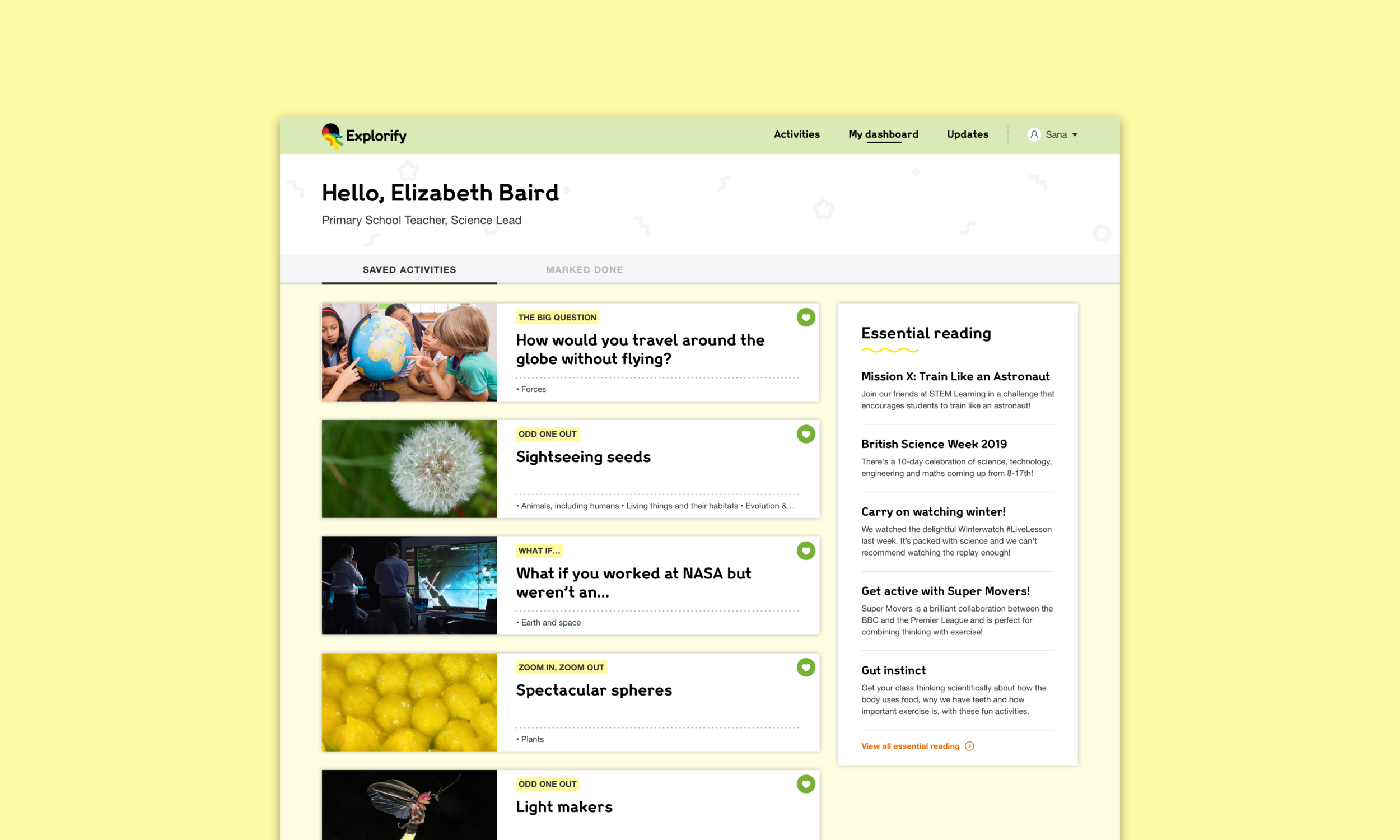
A personal dashboard
Save activities MVP
Activity page for BAFTA-winning children’s presenter Maddie Moate


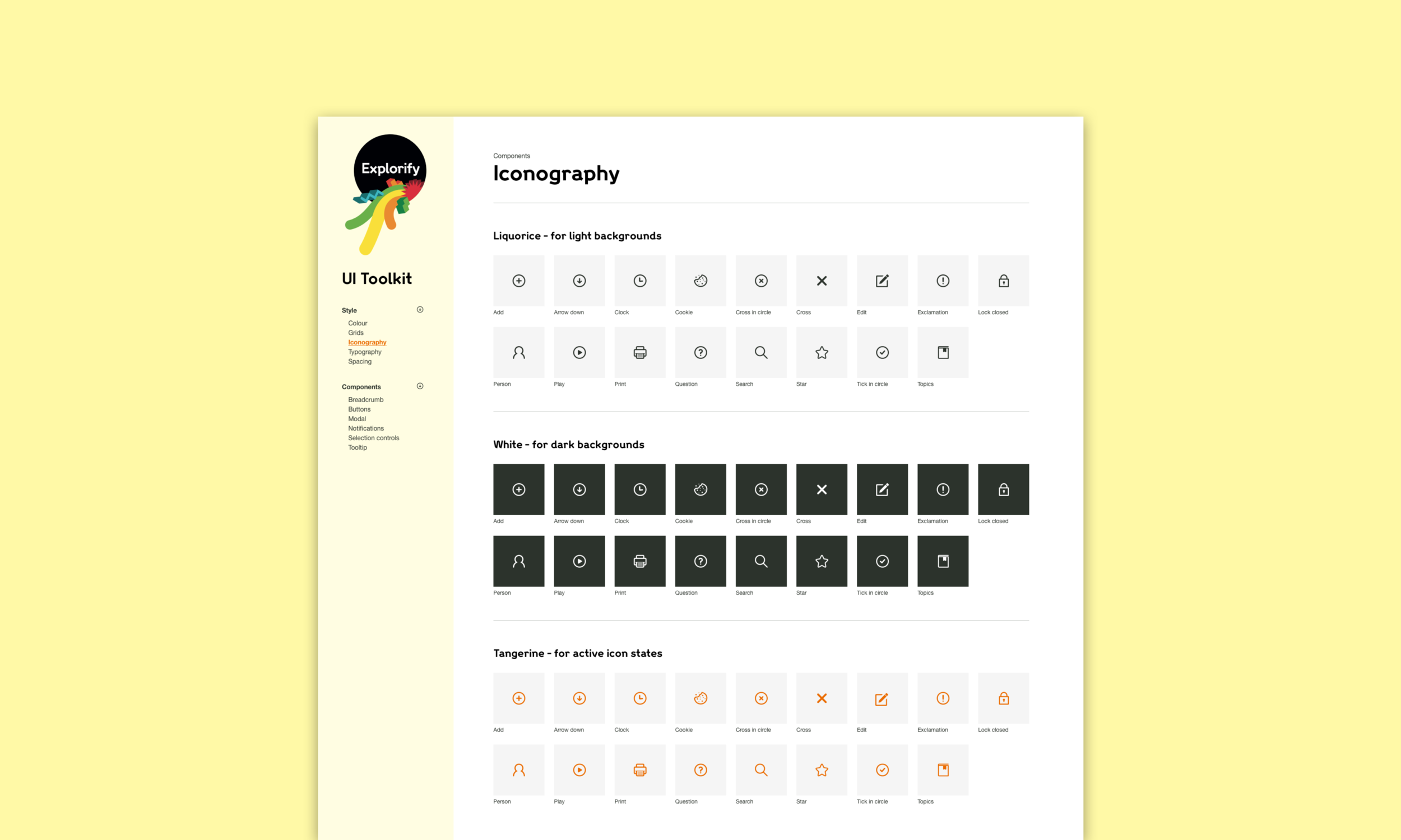
Creating the style guide
When I joined the Explorify team, UI was a mess. Multiple freelancers had worked on the product leading up to its launch. With no style guide in place, a lot of design and tech debt had occurred. There was no grid and page designs were created in Illustrator. Not ideal!
Alongside sprint work, I worked continuously to create a design system and implement a working grid with the tech team. When I left after 16 months Explorify had a Sketch library of assets and a design system in InVision DSM.


