Sofar Sounds
Role: Senior product / UI designer
Sofar Sounds reimagines the live event experience through curated, secret performances in more than 400 cities globally. I worked within the Fan Experience product team. This consisted of a Lead Product Designer, Researcher, PM, and Tech Team. My main focus was around transforming the paid discovery purchase journey from our social media adverts.

Problem
Sofar was targeting growth via a PPC (Pay Per Click) journey. Data showed that the city pages had a high bounce rate. We wanted to reduce the bounce rate and get more users moving through the funnel to purchase tickets.
Goal
Boost the percentage of users creating a Sofar account from 4.9% to 8%.
Testing round 1
We user-tested 10 participants with the current PPC flow. One half was unfamiliar with Sofar events, the other half had attended at least one event. Each session started with a critical incident interview where participants described a recent “experience” or live music event they’d been to. As they spoke I used post-it notes to live plot the user journey.

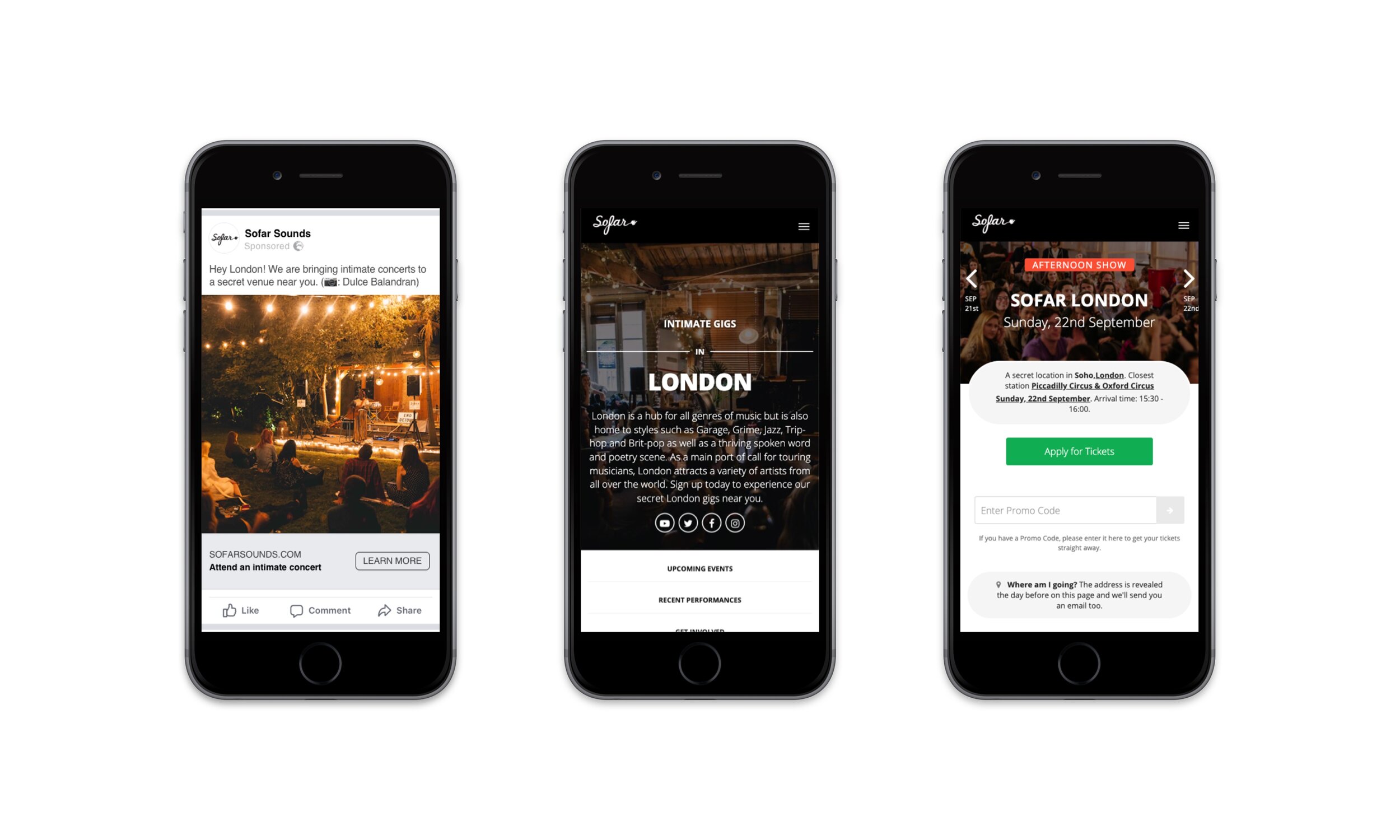
We then moved into the user research part of the testing. The participant used the prototype to experience the journey from a paid Facebook ad to the Sofar city landing page. Feedback was given throughout the journey while both the participant and screen were recorded.
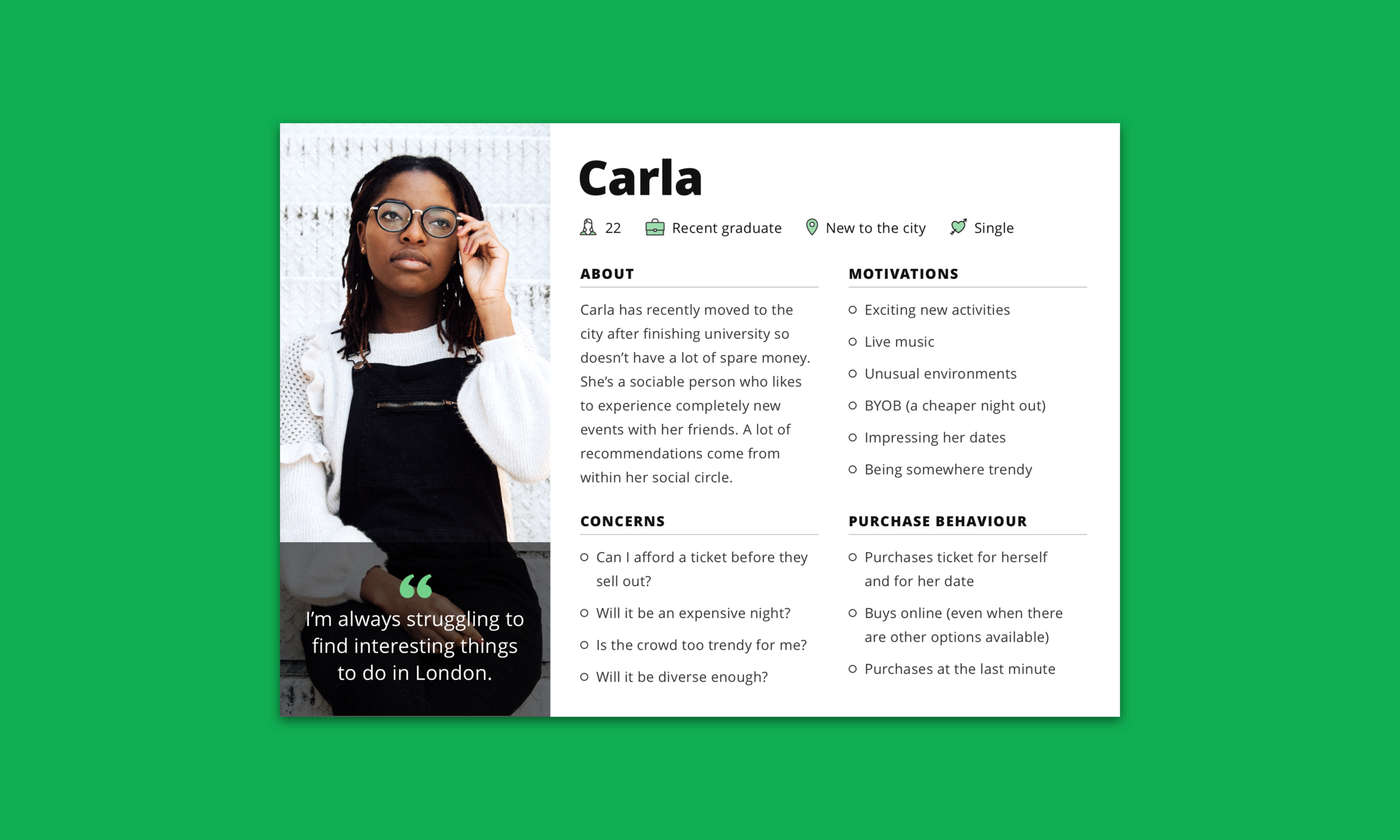
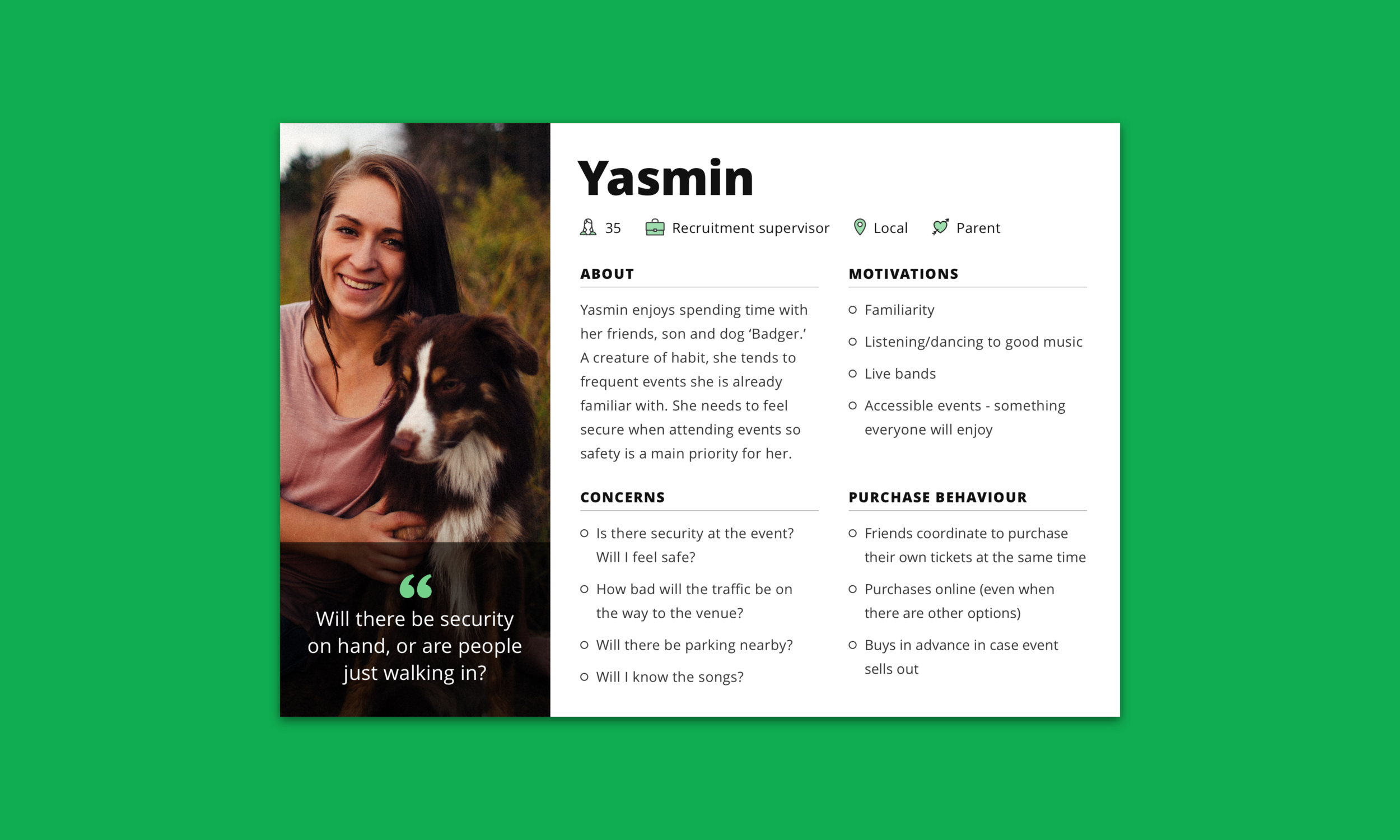
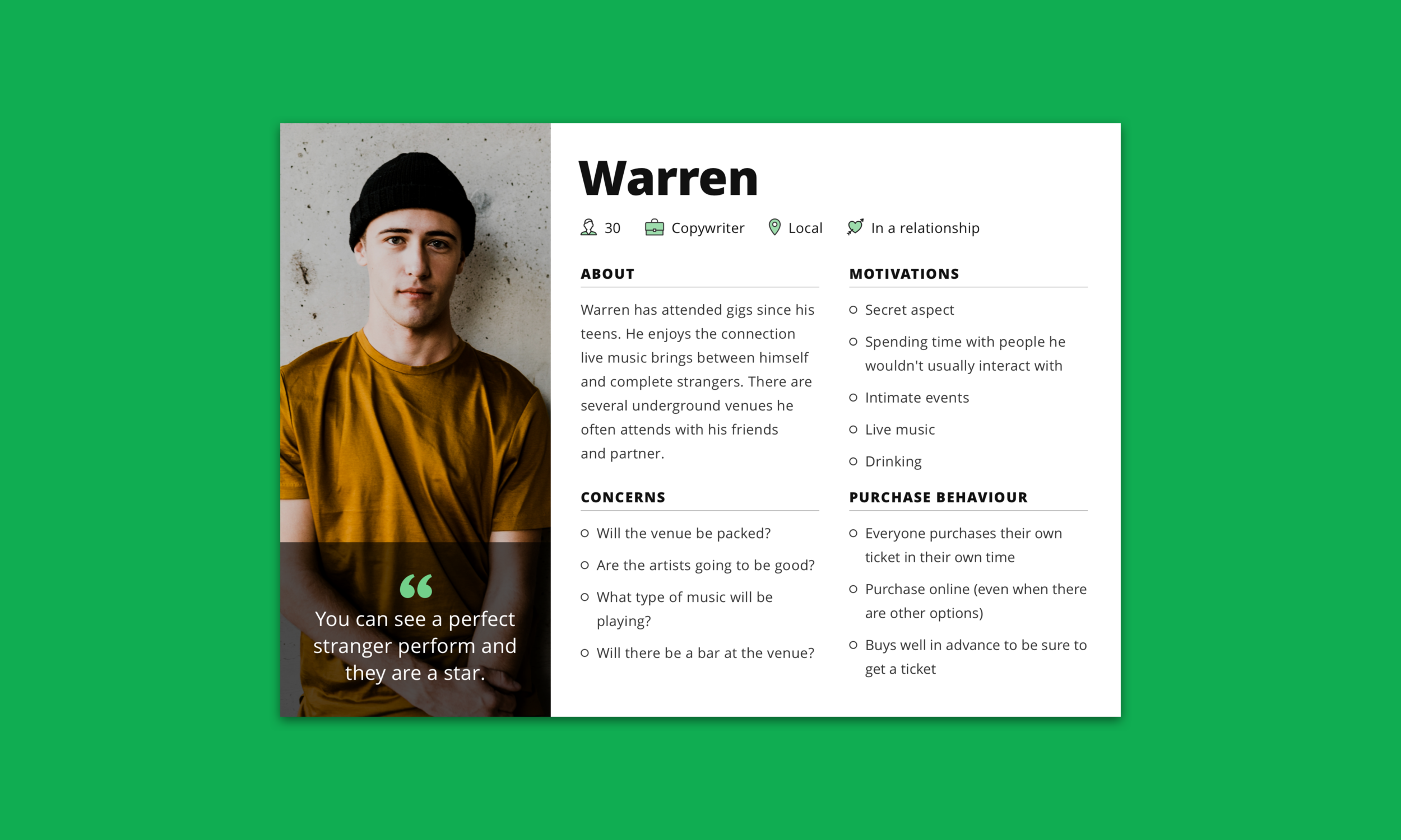
Research synthesis: Persona creation
Using the data collected I created three personas and user journeys. These were then used in an ideation workshop to create how might we questions.
Research synthesis: Themes
Insight from the testing showed common themes were preventing users from completing their application. For further clarification, we ran a Hotjar poll on the London city page. We asked the question:
Do you have any questions about the following before you complete your application?
Price 58%
Genre 37%
Show duration 17%
Venue details 13%
How Sofar works 13%
Other 0%
The issues preventing users from purchasing tickets were: Value prop messaging, music, vibe, price, safety, trust, diversity & inclusion, venue/location. We plotted these themes on a prioritisation matrix of value versus effort to give us a starting point. Ultimately, we tackled all themes through our design iterations.

Testing round 2
Two new city page designs were created using the themes from Testing round 1 and HMW questions for guidance. We tested the designs with 6 unmoderated and 6 moderated users. Participants carried out their tasks on one design. They were then shown the alternative for comparative feedback.

Design A (left) created by lead designer Alex Dawson. Design B (right) created by me.
Research 2 synthesis
Results from UT2 were mostly positive.
Users responded well to social proof and UGC, using these modules to read vibe and audience.
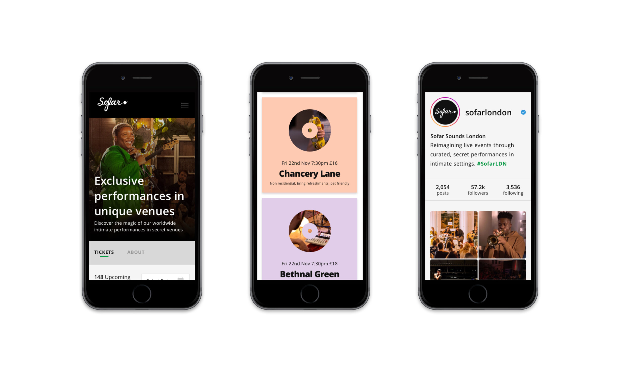
My pastel coloured event cards were the firm favourite of the two variants. The obscured image helped to convey the exclusive Sofar vibe. However, several users commented on the repetitive aspect of the ‘S’ cutaway logo.
Users liked seeing the price, commenting shows were cheaper than anticipated.
The ‘Sofar Experience’ icon panel preferred over the ‘How Sofar works’ slider.
Venue terminology on the event cards needs clarification. ‘Commercial’ was mistaken for commercial music and ‘Residential’ as resident bands.
Final changes
I ran an in house ideation workshop to help us find suitable wording for the event cards. You can view the results here.
Users liked the use of imagery on the cards but we needed a design that wasn’t misleading or repetitive. I created many event card concepts before deciding on the pastel-hued, record cutout style.

User testing 3
We created a unified page design based on feedback from UT2 which underwent a final round of testing. As a team, we created 6 hypotheses. More than 50% of users had to pass each hypothesis for the design to be approved. The final design was a success and pixel perfect UI handed to the developers.
Results
The aim was to increase the conversion rate by 3.1%. The new designs increased CVR by 13% and improved the activation rate by 41%. A huge success.
You can see the original city page below on the left. It hadn’t been updated in 5 years! Our new, improved design to the right.

Old design (left) new and improved design (right)

